Environment Variables
Sprinkling css into an app is a lot like configuring the environment variables for your app to render correctly on the client-side. While this may sound like a powerful thing to do, setting up the environment on the client-side is just one of the responsibilities that a frontend developer (or designer) must bear.
Toucaan makes it easy to configure and deliver a fully-realized browser environment from one place.
Vendor Normalization
The first soft layer of setting up environment variables for your application is handling the vendor inconsistencies up and close. Toucaan does this ground-up.
Traditionally, applications have required injecting a fairly heavy reset, reboot, or normalize css file before any other application style could be included. Toucaan does not use this strategy.
Toucaan uses the baseline method instead.
A todo app will likely not require the block of normalization code meant for video tag, for example.
The Env Folder
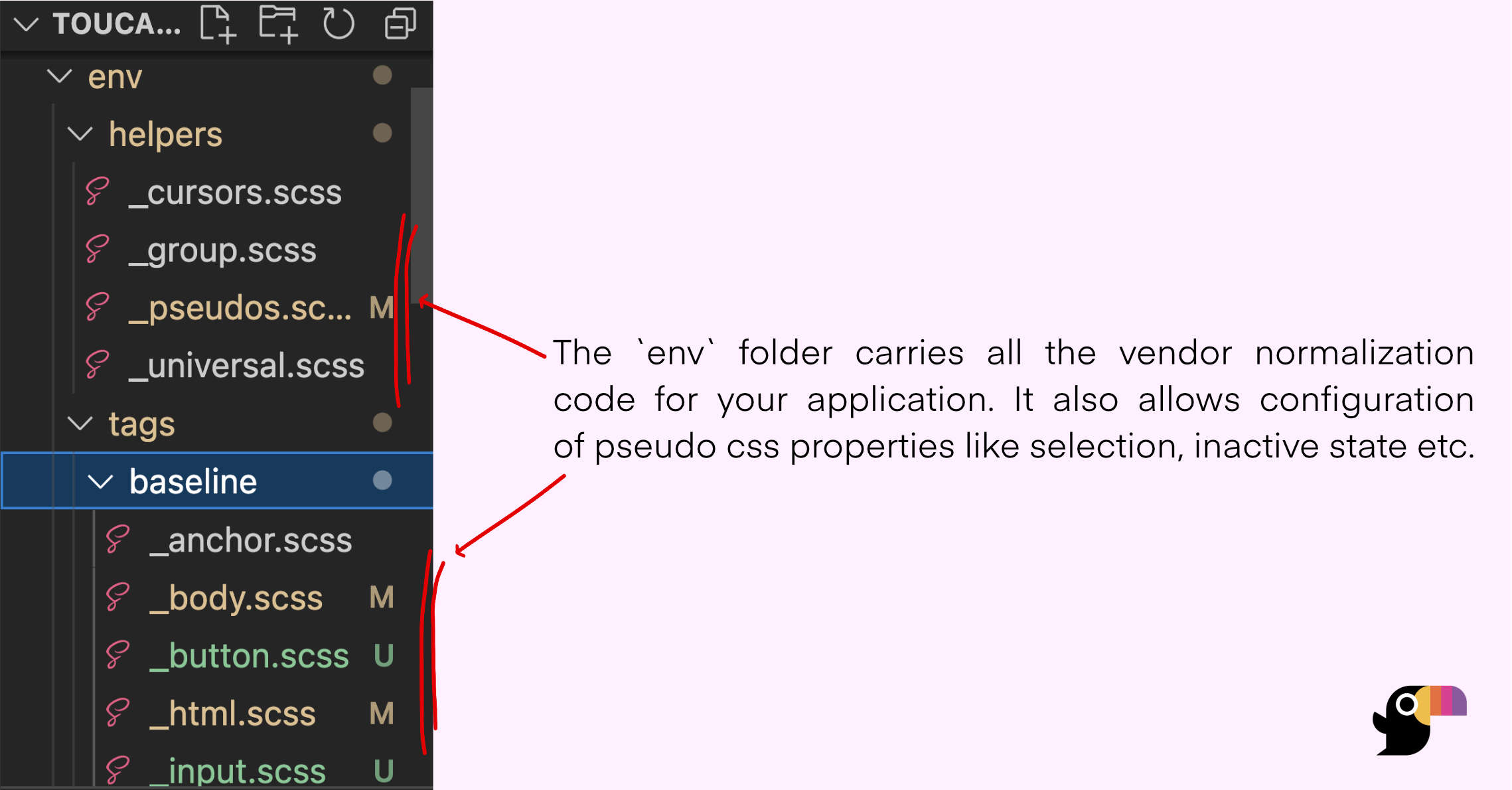
Open the env folder inside toucaan submodule to reveal its contents:

Inside the env folder you'll find two subfolders named helpers and tags each carrying a few initial defaults. Only a few baseline tags and pseudo-classes are included in the environment by default but you can add more into the context as needed.
The env must be customized according to the actual HTML vocabulary of your app.
Desktop's Case
This is how the environment for a desktop browser is reset:
/* Notch handling isn't required on desktops. */
/* @import '../../accessibility/notch';  */

/* ~ Other css and typeset defaults might come here */

/* Notice the first Environment Variable. */
@import '../../env/helpers/universal';

/* A baseline HTML environment. */
@import '../../env/tags/baseline/html';
@import '../../env/tags/baseline/body';
@import '../../env/tags/baseline/anchor';
@import '../../env/helpers/pseudos';

/* and so on… */
Take a look at the desktop.scss file to see a real desktop reset followed by the space for application styles to be written by you.
A desktop displays along the landscape-axis of intrinsic design, whereas a mobile on the portrait-axis.
Mobile's Case
Like with the desktop, the environment of a mobile browser can be set like so:
/* Read more about the notch → https://bubblin.io/blog/notch */
@import '../../accessibility/notch';

/* ~ Other css and type defaults here */

/* Notice the first Environment Variable. */
@import '../../env/helpers/universal';

/* A baseline HTML environment. */
@import '../../env/tags/baseline/html';
@import '../../env/tags/baseline/body';
@import '../../env/tags/baseline/anchor';
@import '../../env/helpers/pseudos';

/* and so on… */
Since most developers and designers like to work on a desktop, Toucaan recommends to configure the desktop environment first. Not mobile or mobile-first!
Head Level Configuration
A part of the configuration options provided in the _config.scss file (see the last chapter) are also environment properties.
Here are some of the things for you to configure:
- Decide on a color palette,
- Choose the right typeface(s),
- Host the type yourself or use a service,
- Apply initial defaults for common tags (or use the one provided),
- Choose a selection color in active and inactive states,
- Configure behavior and accessibility of form elements, and so on…
The key here is to break it down into small piece and config the framework as you go on to build intrinsic UX/UI for each device category that you end up supporting for your users. Contextualize properties like touch-action: auto and pointer: coarse according to the need of the medium and move them out of the way from environments that do not require those.
Go to the next chapter on Intrinsic Typography.